Get Started With Compose Multiplatform To Build Desktop And Mobile Apps

Compose Multiplatform is a UI framework made by Jetbrains to simplify and accelerate desktop and mobile application development using Kotlin with a more declarative API (less imperative). It targets the JVM and thus can be used to build cross platform GUI apps. It also supports other platforms such as web.
It's based on Kotlin Multiplatform that enables cross-platform development and the Jetpack Compose declarative UI Toolkit made by Google for Android. Combining the two technologies make it possible to share, partially or entirely, UI implementation for your applications on Android, Windows, iOS, macOS and Linux. More details about the compatibility and the differences with Jetpack Compose available here.
Using Kotlin to design user interfaces promotes less bugs, better tooling support and more concise and robust code. This is achieved using a declarative UI model based on composable functions, which take in parameters to describe the UI logic without returning anything and must be free of side-effects. A more complete conceptual model is presented in this Thinking in Compose documentation page.
JDK 11 or later is required. You can either use the JDK provided by the IDE, IntelliJ IDEA Community Edition or Ultimate Edition 20.2 or later, or follow this tutorial if you need to get started with Java, JDK and IntelliJ IDEA.
- Use the Kotlin Multiplatform Wizard to create and download your project starter. In this tutorial we will be using desktop and Android, but you can select just desktop at first
- Extract and move the folder to your workspace
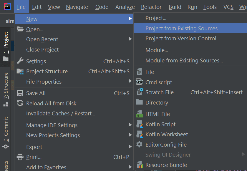
- Open IntelliJ IDEA and from the files menu, create a project from existing sources using the extracted folder
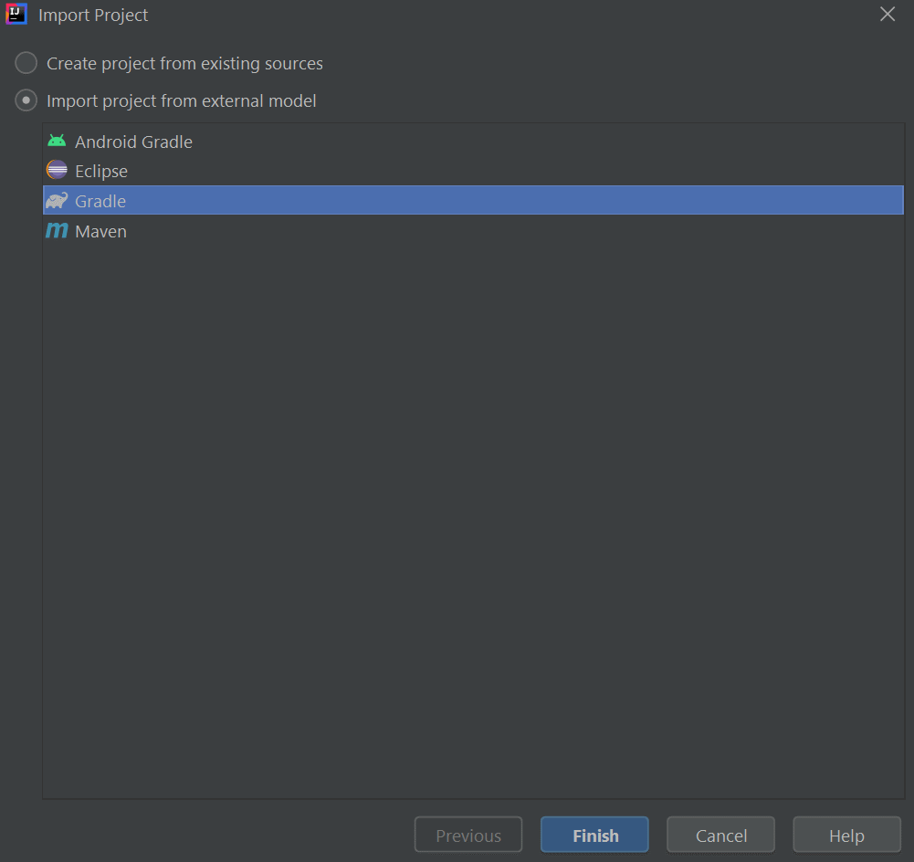
- Choose Gradle as the build system
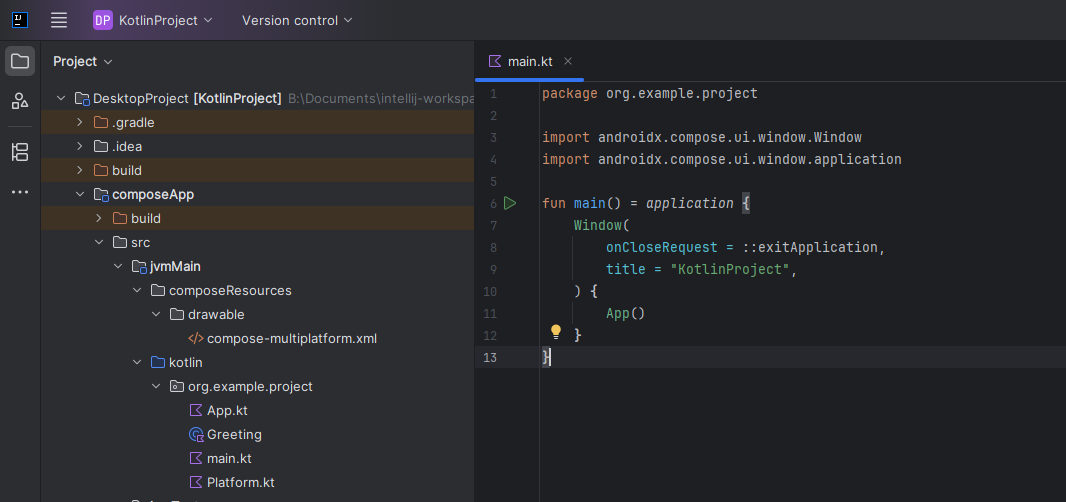
- To start the project, either open the
main.ktfrom the project source and click the green play icon next to the main function, or open the terminal from the project's root directory and launch./gradlew run(.\gradlew runif using Windows Batch)
To use Android on IntelliJ IDEA, you will need to install the Android plugin and the Android Design Tools plugin. After that you will have to download the Android SDK using the Android SDK Manager. To run your application on Android, you will need to create a virtual device from the Tools menu using the Android device manager.

To dive deeper into Compose Multiplatform concepts and learn it by practice, we will implement in this section a calculator UI. The resulting UI will look like this:

The app's full source code is available on GitHub.
Folder structure
The main code source can be found at composeApp/src. There is 4 modules:
androidMain: Android specific code (basically app icons and window positioning)commonMain: shared assets and icons (see Setup and configuration for multiplatform resources)composeMain: shared UI implementation between desktop and AndroiddesktopMain: desktop specific code

This project used a slightly different structure than the default one. More information on Kotlin Multiplatform project structure and how to tweak it available here.
Desktop specific code
composeApp/src/desktopMain/kotlin/jetbrains/compose/calculator/Main.kt
package jetbrains.compose.calculator

import androidx.compose.ui.Alignment
import androidx.compose.ui.unit.dp
import androidx.compose.ui.window.Window
import androidx.compose.ui.window.WindowPosition
import androidx.compose.ui.window.application
import androidx.compose.ui.window.rememberWindowState
import composeResources.Res
import composeResources.app_name
import composeResources.calculator
import jetbrains.compose.calculator.resources.Icons
import org.jetbrains.compose.resources.painterResource
import org.jetbrains.compose.resources.stringResource

fun main() = application {
    Window(
        title = stringResource(Res.string.app_name),
        state = rememberWindowState(
            width = 400.dp,
            height = 500.dp,
            position = WindowPosition.Aligned(Alignment.Center)
        ),
        icon = painterResource(Icons.calculator),
        onCloseRequest = ::exitApplication) {
        App()
    }
}
You can see some window positioning logic and the desktop icon definition (imported from the the commonMain module). The App logic is defined in the composeMain module.
You can avoid hardcoded strings using string resources.
Android specific code
composeApp/src/androidMain/kotlin/jetbrains/compose/calculator/MainActivity.kt
package jetbrains.compose.calculator

import android.os.Bundle
import androidx.activity.ComponentActivity
import androidx.activity.compose.setContent
import androidx.activity.enableEdgeToEdge
import androidx.compose.foundation.layout.Box
import androidx.compose.foundation.layout.systemBarsPadding
import androidx.compose.runtime.Composable
import androidx.compose.ui.Modifier
import androidx.compose.ui.tooling.preview.Preview

class MainActivity : ComponentActivity() {
    override fun onCreate(savedInstanceState: Bundle?) {
        enableEdgeToEdge()
        super.onCreate(savedInstanceState)

        setContent {
            Box(
                modifier = Modifier.systemBarsPadding()
            ) {
                App()
            }
        }
    }
}

@Preview
@Composable
fun AppAndroidPreview() {
    App()
}
Some adjustments were made to fit the content correctly within the Android window system.
composeApp/src/androidMain/res/
Android resources such as images, localization and the AndroidManifest.xml for permissions and other configurations.
SVG icons are not supported natively by Android, but you can import them as Vector Assets.
You can follow the tutorials for Jetpack Compose (see References section) to learn more about other components.
UI implementation
composeApp/src/composeMain/kotlin/jetbrains/compose/calculator/App.kt
package jetbrains.compose.calculator

import androidx.compose.foundation.layout.Column
import androidx.compose.foundation.layout.fillMaxHeight
import androidx.compose.material.MaterialTheme
import androidx.compose.runtime.Composable
import androidx.compose.runtime.mutableStateOf
import androidx.compose.runtime.remember
import androidx.compose.ui.Modifier
import androidx.compose.ui.text.input.TextFieldValue
import jetbrains.compose.calculator.resources.lightThemeColors
import jetbrains.compose.calculator.view.DisplayPanel
import jetbrains.compose.calculator.view.Keyboard

@Composable
fun App() {
        MaterialTheme(colors = lightThemeColors) {
            val mainOutput = remember { mutableStateOf(TextFieldValue("0")) }
            Column(Modifier.fillMaxHeight()) {
                DisplayPanel(
                    Modifier.weight(1f),
                    mainOutput
                )
                Keyboard(
                    Modifier.weight(4f),
                    mainOutput
                )
            }
        }
}
This is the main user interface imported by the androidMain and desktopMain modules.
Custom colors were defined for the light theme. You can learn more about available design systems here.
This module is implemented without desktop specific components.
Gradle
composeApp/build.gradle.kts
Main Gradle configuration (you need to know about Gradle with Kotlin syntax as well the Kotlin Multiplatform Gradle plugin for advanced use cases).
You can change plugin and dependencies versions for Gradle from gradle/libs.versions.toml
Tooling
The desktop project is already configured with the Compose Hot Reload plugin that makes it to preview directly your code changes after running the project once without restarting. This is is only available for JVM (not for other mobile or web targets).
You can preview your changes in the IDE for Android projects with the @Preview annotation on composable functions using the buttons on the top right area (see the AppAndroidPreview function on Android specific code).
Kotlin Multiplatform
Jetpack Compose
- Get started with Jetpack Compose
- Jetpack Compose tutorial
- Jetpack Compose basics: codelab (coding lessons and exercises)
- Layouts in Jetpack Compose: codelab
- Jetpack Compose samples: Official project samples
- Jetpack Compose Playground: Community-driven collection of Jetpack Compose example code and tutorials